Wednesday 4 June 2014

Final task (Design Envelope , Folder , Name Card and Letterhead)

My Name Card Design
My Folder Design


My Envelope Design


My Letterhead Design


Set Stationery template
-After print 


Start Trace and put Color in Adobe Illustrator

-Trace that logo in Adobe Illustrator
-Make sure insert company name


-After finish trace the logo
-ready to put the color
-Make sure put CYMK number
-this is because people can know what color we use


-Last step choose 1 the best color
-That be our real own company logo


- I choose this color because it just use 2 color
- easy to make people remember this color
- Beside that , this color match with my background (black)

Design our own logo company

-Firstly draw in paper
-try to make as simple as you can


my drawing logo


-After that choose 1 logo that we want
-Ready to trace


Make own idea logo using shape

-make black and white logo just use this shape only
-this task is to train us to evolve our idea


My result


Research for corporate logo

Research for corporate logo

5 logo and their meaning


-Use a simple font and easy to read
-their logo look interesting
-can be read from many side
-just use 1 simple color

- there is the letter C is hidden behind Carrefour logo
-Meaning of the Carrefour logo itself is a 2 arrows point to the left and the other leads to the right.
- Interpret the word "carrefour" in French means "crossroads"
-The color itself based on the flag of France, where Carrefour established.

- if you look at it more closely, you'll notice that there is a number 1 in the space between the F and the red strip-strip.
-The red strip is to represents the speed.
-just use 2 simple color

-In 1953, Baskin-Robbins produce an innovation in which they offer a total of 31 ice cream flavors.
-While the 31 is clearly visible eliminated, the 31 is hidden in the letters B and R.
-if the color not pink sure many people don’t know that number “31” is still have in that logo.
-Meaning of the number 31 itself is meant for everyone to feel the different taste every day, most of which 1 month consists of 31 days.

-Most people are probably unaware that Monster Energy drink hails Satan with it’s logo. The three lines that seem to make up the letter M are actually three Hebrew letter Vav’s – which have a numerical value of 6.
-nice green color based nature
-interesting font 

My Final Poster

Series 1


Poster name : "Light of Life"

This manipulation poster is use Adobe Photoshop. This poster is to present about the benefit of reading books. Reading is a great way of taking your focus of attention of your everyday troubles and worries for a while as it transport you to places, dream worlds and cultures that you may know little about or you were not even aware they existed. As we can see in this poster the benefit come out from the tree for example heart (feeling) brain(knowledge) menthol(idea) and that kids spend his time to read the book. Furthermore, as we can see the typography in this poster also to show about the benefit of reading book. You can learn and better your life just by reading a book.


Series 2


Poster name : "Positive effect to whole the world from reading habit"

Related from the first series poster the benefit can be effect to whole the world. I mean the positive effect. people nowadays must have enough knowledge to live in this modern  era. This all benefit are important in our life. as we can see that colorful typography refer to how the colorful of our life in good reading habit. For sure the positive habit can give the positive effect for whole the world. Let us remember that one book, one pen, one child, and one teacher can change the world.


10 Benefits of Reading

Mental Stimulation
Stress Reduction
Knowledge
Vocabulary Expansion
Memory Improvement
Stronger Analytical Thinking Skills
Improved Focus and Concentration
Better Writing Skills
Tranquility
Free Entertainment

One of Designer that make books poster

DAVID CARSON


Audacious graphic designer from Southern California, best known in the surf world for his jarring but innovative 1991 redesign of Surfer magazine. Carson was born (1956) in Corpus Christi, Texas, began surfing after moving with his family in 1965 to Cocoa Beach, Florida. In 1973, four years after relocating to Rolling Hills, California, Carson was a top-rated competitor in the Western Surfing Association's prestigious AAAA division, and in 1976 he appeared in the surf film Playgrounds in Paradise. He was invited to the Smirnoff Pro-Am surf contest in the early '70s, and for a time Infinity Surfboards sold a "David Carson" model board. Carson earned a B.A. in sociology from San Diego State University in 1977; in the early '80s he enrolled in a series of graphic design workshops.

Carson then became the art director for a series of magazines, including TransWorld Skateboarding (1983–87), Musician (1988), Beach Culture (1989–91), Surfer (1991–92), and Ray Gun (1992). By the time he arrived at Surfer his dark-palette, industrial meltdown style—featuring compressed text; mismatched font size; chopped, scratched, cut, and mixed type; and radically cropped photos—was fully developed. Some Surfer readers liked Carson's redesign right off the bat, but a majority felt, as one Pasadena subscriber put it, that the new look was "jumbled, ugly, chaotic and hard to read." 

Carson has been nominated for inclusion into the East Coast Surfing Hall of Fame in 2014. That year he will also receive the American Institute of Graphic Arts Gold Medal for Contribution to the Field of Design.


David Carson Poster

A poster for a lecture held by Graphic Designer, creator of 'Ray Gun' magazine, and leader of the deconstruction movement- David Carson (held in the year 2000).

Quicksilver poster by David Carson


"contemporary ode" to the deconstructivist style of David Carson - a far more subtle approach that the work as seen by Carson (particularly throughout 'Ray Gun')- but a refreshing example of how deconstruction in graphic design can work "for the masses" in a more legible and readable layout and format structure.


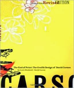
Books by David Carson

Carson and his work have been the subject of a handful of books: The End of Print: The Graphic Design of David Carson (1996), David Carson, 2nd Sight: Grafik Design after the End of Print (1997), and Fotograficks: David Carson (1999). Carson designed the Laguna Art Museum-commisioned Surf Culture: The Art History of Surfing, was published in 2002. Carson put together a compilation of his own work, Trek in 2003. "Design and Discovery," Carson's 2003 TED Talk, has been viewed nearly a half-million times.

The Book of Probes by Eric McLuhan, David Carson, Marshall McLuhan and William Kuhns (Nov 2003)


The Book of Probes by Eric McLuhan, David Carson, Marshall McLuhan and William Kuhns (Nov 2003)


      Trek: David Carson, Recent Werk by David Carson and Jamie Brisick (Mar 8, 2004)


The End of Print: The Grafik Design of David Carson by Lewis Blackwell, David Carson and David Byrne (Oct 2000)

Final Research (Books)

BOOKS


Book History Timeline From 1810-2004

1810 185 working paper mills in the US. 
1812 Friedrich Koenig perfects first steam-powered, flat-bed-and- cylinder press. 
1814 The Times (London) prints first issue using Koenig press, 29 November, 1,000 impressions per hour. 
1816 Koenig adds perfector to his press. 
1822 Dr. William Church patents first cold-metal composing machine. 
1825 First dandy rolls used in paper making, built by John Marshall. 
1827 Cowper & Applegate develop four-cylinder steam press capable of 4,000-5,000 impressions per hour. 
1829 William Austin Burt invents early typewriter. 
1829 First stereotype plates made from flong molds used in Lyons. c. 
1830 Isaac and Seth Adams manufacture bed-and-platen machine press. c. 
1830 Hopkinson and Cope manufacture double-platen machine press. 
1833 Daguerreotype process invented. 
1835 Robert Baxter registers patent for letterpress color printing process. c. 
1840 Electrotype process developed. 
1841 Tauchnitz introduces line of paperback editions. 
1843 Mechanically-processed wood pulp used for paper making in Germany. 
1846 Richard Hoe patents horizontal rotary press.
1853 Mechanically-processed wood pulp used for paper making in England. 
1863 William Bullock patents reel-fed rotary printing machine. 
1868 The Times (London) installs Walter press that prints on continuous roll of paper. 
1870s Chemically-produced wood pulp introduced to paper making. 
1875 JGA Eickhoff builds four-cylinder perfecting press. 
1878 Remington introduces typewriter featuring shift key for upper-case letters.
1886 Ottmar Mergenthaler invents Linotype hot metal composing machine. 
1886 Berne Convention establishes international reciprocity of copyright protection. 
1887 The New York Tribune begins using Linotype for composition. 
1889 Tolbert Lanston produces first Monotype composing machine. 
1892 The Bibliographical Society founded in London. 
1904 Ira Rubel develops first commercial lithographic system for printing on paper. 
1904 The Bibliographical Society of America founded in New York. 
1935 IBM markets Electromatic, first successful electric typewriter. 
1938 Chester F. Carlson invents xerography. 
1945 Monotype Corp. introduces Intertype Fotosetter, the first phototypesetter. 
1955 Universal Copyright Convention establishes copyright protection for 50 years after author’s death. 
1959 Xerox markets first xerographic photocopier. 
1967 OCLC founded. 
1975 IBM introduces first laser printer. 
1983 RBS founded. 
1995 Jeff Bezos founds Amazon.com.
 1995 Instabook applies for print-on-demand technology patent. 
1997 International copyright protection extended to 70 years after author’s death. 
2004 Google announces Google Print project.

Teenager’s problem to read the books

When scaling throughout the sizeable globe we could easily come to a conclusion that people in this modernized era are encountering vast number of problems. The problem I would like to emphasize about is something that will definitely leave a negative impact towards oneself and the country when the individual failed to notice its growth and development in their own body. Perhaps it would even be the downfall of a country’s economical level especially when it comes to competing with another nation or even globally. Yes, I am indeed talking about the lack of reading culture in our youths. For some this is not even a problem as it is just another trifling matter that they come across in their daily life yet they fail to notice that education is the single most essential factor in shaping the nation tomorrow as the saying goes education is the key to success. Furthermore, the educational level also reflects the image of a country to the neighbouring country as well. Ironically, teenagers nowadays do not seem to be paying a closer attention toward their academic level as a result of lack of reading culture. So, this raises a curiosity on what are the factors that propels them in cultivating this bad culture which will only tarnish their own image. The dominant factor which contributes towards this rampant problem would definitely be the negative influence of the friends.


Sunday 1 June 2014

Final Task ("How the picture is complete?")

- Final Task
-"How the picture is complete?"


-Animate the font
-Make it look interesting


-Put image of methol (symbol of idea)


-Animate the image make it like it is drawn


-And the last step is put the color


My Result


Task 4

-The introduction of name
-Create font on Adobe Illustrator
-And transfer to Adobe After Effect


My result

Task 3

-Create something use alien picture


My result


Task 2

-Just use ae training file


My result